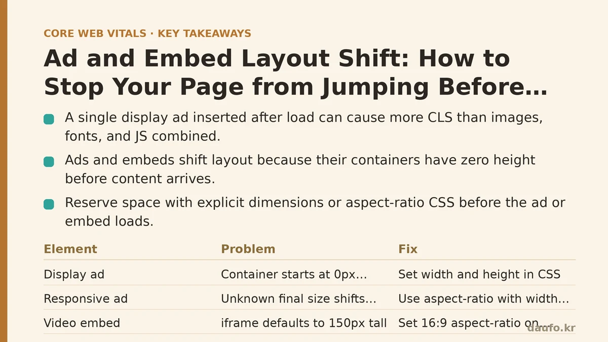
A single display ad inserted into a page after load causes, on average, more layout shift than all your images, fonts, and JavaScript combined. That’s not hyperbole. The largest single source of CLS on the modern web is third-party content you don’t control: an ad network injects a banner twenty pixels taller than the space you reserved, or an embedded video player’s aspect ratio defaults to 4:3 instead of 16:9, and your article’s text jumps down a full screen, right as the reader’s finger hovers over a paragraph.
The counterintuitive part: the fix is rarely “remove the ads.” It’s about making your layout stable before the ad loads, so that when it arrives, the page doesn’t move. This guide walks through the exact symptoms, causes, and code-level fixes, in a troubleshooting format you can apply to your own site in the next hour.
Symptom: CLS spikes in the 0.3–0.7 range, concentrated on article pages
You run Lighthouse or CrUX and see a CLS score that fails the “good” threshold (under 0.1). The breakdown shows the problem is not in your CSS or font loading—it’s in a specific window of time after the DOM is ready but before load completes. When you add the layout-shift debug flag to the Performance Observer API, you see entries flagged with hadRecentInput: false and sources pointing to an element with a data-ad-slot attribute, or an <iframe> from a video or social embed provider.
Cause: The ad/embed container has zero height before content arrives
The sequence looks like this:
- Your HTML parser encounters the ad
<div>or embed<iframe>. - The element is empty, so the browser assigns it a height of
0px. - The rest of the page renders, pushing your main content into the space where the ad will eventually render.
- The ad network’s script runs, injects a 728×90 or 300×250 creative, and the container grows.
- Every element below the ad shifts down. The browser records—and reports—that movement as layout shift.
The same failure mode hits embedded tweets, YouTube players, and map widgets. The initial iframe height defaults to 150px (the HTML spec default for an iframe without attributes), which shifts when the embed’s content loads and the iframe resizes to its real height.
Fix: Reserve the space with explicit dimensions or aspect-ratio CSS
The browser cannot prevent shift if it doesn’t know the final size of the element before its content arrives. Your first move is to give it that information.
Step 1 — Measure the ad’s actual rendered size (setup)
Open your page in an incognito window. Inspect the ad container after the ad loads. Note the offsetWidth and offsetHeight of the element that directly wraps the ad creative. In most ad server implementations (Google AdSense, Prebid, Amazon TAM), this is a <div> that receives an injected <ins> or <iframe>.
Step 2 — Set the container’s dimensions in CSS (change)
For a fixed-size ad, it’s a one-line change:
.ad-slot--leaderboard {
  width: 728px;
  height: 90px; /* from your measurement */
}
For responsive ads, use the CSS aspect-ratio property plus a width constraint, which works in all modern browsers:
.ad-slot--rectangle {
  width: 100%;
  max-width: 300px; /* the ad's design width */
  aspect-ratio: 300 / 250; /* width / height from the creative */
}
For embeds, apply the same logic to the iframe. A YouTube embed should look like this:
.video-embed {
  position: relative;
  width: 100%;
  aspect-ratio: 16 / 9;
}
.video-embed iframe {
  position: absolute;
  top: 0;
  left: 0;
  width: 100%;
  height: 100%;
}
The aspect-ratio property forces the container to a 16:9 ratio regardless of its width, so the iframe inherits a stable height before a single byte of the video loads. (For older Safari versions, add height: 0; padding-bottom: 56.25%; as a fallback.)
Step 3 — Verify the fix in Lighthouse and CrUX (verify result)
Run Lighthouse again. The CLS score on the affected route should drop below 0.1. But Lighthouse is a synthetic test—the real confirmation comes from observing the layout-shift entries in the Performance Observer:
new PerformanceObserver((list) => {
  const entries = list.getEntries();
  for (const entry of entries) {
    if (entry.hadRecentInput) continue;
    console.log('Layout shift:', entry.value, 'sources:', entry.sources.map(s => s.node?.tagName));
  }
}).observe({ type: 'layout-shift', buffered: true });
If the only sources left in the log are elements you intentionally shift (like a modal opening or a button being inserted), your fix is working. Then watch CrUX data over the next 14–28 days for the field-level confirmation.
Symptom: Ads load, but the reserved space is the wrong size
You set width: 300px; height: 250px on the ad container. The ad loads at 300×250. The layout does not shift. Then the ad network serves a different creative in the same slot—a 320×100 mobile leaderboard—and the container’s fixed height clips it or leaves a gap.
Cause: You hard-coded dimensions for one creative, but the slot serves multiple sizes
Ad networks routinely rotate creatives based on audience, device, viewport, and auction dynamics. If you fix the container to one size, you either cause overflow (the creative is larger than the container) or whitespace padding (the creative is smaller). Both are bad: the former causes new shifts, the latter hurts ad revenue and looks broken. The same happens with embeds that support multiple aspect ratios, like an Instagram post (which can be square or portrait).
Fix: Use the ad server’s multi-size API or inject a placeholder that matches the max possible size
The safest approach is to reserve the maximum dimensions the ad can serve, then center the creative inside that space. Here’s a concrete implementation for Google AdSense:
<div class="ad-slot--multi" id="ad-slot-1">
  <!-- Ad script will overwrite the contents -->
</div>
.ad-slot--multi {
  width: 100%;
  min-height: 250px; /* max height across all creatives in this slot */
  display: flex;
  align-items: flex-start;
  justify-content: center;
  background: #f5f5f5; /* uniform background hides size mismatches */
}
With AdSense, you can also define multiple ad sizes in the client code:
// Google Publisher Tag style setup
googletag.cmd.push(() => {
  const slot = googletag.defineSlot('/6355419/Travel/Asia', [
    [300, 250],
    [320, 100],
    [300, 600]
  ], 'ad-slot-1');
  slot.addService(googletag.pubads());
  googletag.enableServices();
});
Then reserve the tallest of those sizes:
#ad-slot-1 {
  min-height: 600px; /* tallest option: 300x600 */
  width: 100%;
  max-width: 300px;
  margin: 0 auto;
}
The trade-off is offset by the guarantee: a 300×250 sticky banner load in a slot that was sized for 300×600 will leave dead space, but the page will not move. When the 300×600 creative wins the auction, the container is ready, and the layout stays stable. This “reserve the max” strategy is what production ad-heavy sites use in practice, often paired with lazy-loading the slot so the dead space only exists if the ad loads.
Symptom: The page shifts when the ad disappears (or when the embed fails)
Your layout is rock solid when the ad loads. But if the ad network fails to bid—or the user has an ad blocker—the container collapses to zero height, and all the content below it jumps up. The same loop hits a video embed that throws a geographic-block error.
Cause: The reserved space conditionally renders
If you apply aspect-ratio or height only to a container that exists when the ad loads, the container itself is removed from the DOM when the ad fails. The browser recalculates layout, and shift occurs.
Fix: Keep the container in the DOM with a minimum height, always
The container must exist as a physical element in the page’s layout before the ad request fires, and it must stay there regardless of the request outcome. This means:
<div class="ad-slot--reserved" id="dfp-slot-sidebar">
  <!-- Empty placeholder: still occupies space -->
</div>
.ad-slot--reserved {
  min-height: 250px; /* even if the ad never fills it */
  width: 300px;
  max-width: 100%;
}
Then, in your ad-loading script (using Google Publisher Tag as the example), do the following:
googletag.cmd.push(() => {
  googletag.defineSlot('/123456/sidebar', [300, 250], 'dfp-slot-sidebar')
    .addService(googletag.pubads());
  googletag.pubads().addEventListener('slotRenderEnded', (event) => {
    if (event.slot === googletag.defineSlot(...)) { /* guard against double-handling */ }
  });
  googletag.pubads().addEventListener('slotOnload', () => {
    // If no ad rendered, keep the container's min-height as-is.
    // Optionally show a fallback element (e.g., a newsletter signup)
    // but do NOT remove or empty the container.
  });
  googletag.enableServices();
});
The failure mode to avoid: your ad script’s slotRenderEnded or slotResponseReceived handler calls container.innerHTML = '' when it gets a noFill response. That call removes the reserved height because the empty <div> has no CSS height reassigned. The fix is to not clear the container. Instead, keep the min-height class on the <div> and let it display the muted background color. Your layout stays put.
Symptom: CLS is fine on desktop, but mobile shows shifts you can’t reproduce locally
You check the Performance Observer on a real device with DevTools open, and the page is stable. CrUX reports 0.2 on mobile. You test on the same mobile device in Chrome DevTools, manually throttling CPU and network, and you still can’t see the shift.
Cause: Ad scripts that execute after the user scrolls, combined with dynamic injection
Many ad networks use “lazy insertion”: they wait for the viewport to approach an empty <div>, then inject the ad iframe and measure the container’s height. If the container has no CSS height set, the injection causes a shift at scroll time. DevTools captures this only if you scroll at the same speed as a human. Automated tools like Lighthouse test an unstrolled page, so they miss it entirely. Your mobile CrUX data doesn’t.
Fix: Pre-define the height for all lazy-loaded slots, and pair lazy insertion with a “reserve space” script
The ad container needs a height even when empty. Because you don’t know the creative size in advance, the reliable option is to reserve based on the slot’s most common creative size for mobile. Then, in the lazy-load code, check the container’s clientHeight before injecting the ad. If it’s the reserved value, fine. If it’s zero, bail out and set the min-height immediately:
function insertAdWhenNearViewport(containerSelector, slotId) {
  const observer = new IntersectionObserver((entries) => {
    entries.forEach(entry => {
      if (!entry.isIntersecting) return;
      const container = document.querySelector(containerSelector);
      if (!container) return;

      // Guard: if container has no height, reserve space first
      if (container.clientHeight === 0) {
        container.style.minHeight = '250px'; // match mobile leaderboard
      }

      // Now safe to inject the ad iframe/content
      // ... your ad network's tag injection code ...
      observer.unobserve(container);
    });
  }, { rootMargin: '200px' });
  observer.observe(document.querySelector(containerSelector));
}
This is the only approach that handles the “scroll-then-jump” problem: you force the browser to allocate the space before the network call, not after. The trade-off is that empty reserved containers on mobile create extra whitespace for users who never scroll to the ad zone. You can mitigate this by keeping the reserved height modest (250px) and matching it to the highest-probability creative size.
The Hard Rule: Never let third-party code dictate your layout
Every ad network ships a script that, by default, inserts elements without reserving space. Every embed platform (YouTube, Twitter/X, Spotify, Figma) ships an iframe that defaults to arbitrary heights. You cannot trust any of them to maintain your CLS. The only way to keep a stable layout is to impose your own dimensions at the container level.
When you cannot predict the size (a video with a dynamic aspect ratio, an ad slot that serves multiple sizes), reserve the maximum. When the third-party content fails to load, keep the reserved space. When you use lazy loading, make the height reservation part of the lazy-load trigger. Each of those is a single, small reduction in your page’s initial whitespace that buys you a measurable, permanent win in your CLS score.
Apply these fixes to one page template, then verify with the Performance Observer code above after a test on a throttled mobile connection. The shift sources listed in that log tell you whether you’ve eliminated the problem or just moved it.
Related guides: How to Audit and Fix Layout Shifts for Beginners: A Step-by-Step CLS Guide, Cumulative Layout Shift: Why Your Page Jumps Around While Loading, and Animating with Intent: From Janky to Buttery-Smooth 60fps in a Real Dashboard.
🔗 Recommended Reading
- How to Enable Browser Caching on Your Website: A Beginner's Step-by-Step Tutorial
- Web Performance Monitoring Tools Compared: Lighthouse, PageSpeed Insights, and WebPageTest
- CDN vs. Origin Server: Which to Optimize First for Latency
- Common Mistakes That Break Web Font Performance and How to Fix Them
- Site Speed Optimization for Fintech Websites: Balancing Security, Compliance, and Performance