A page that scores green on Lighthouse can still feel broken to a real visitor who taps a “Buy” button a split second before an ad loads and shoves it down the screen. The click lands on the ad instead. That mismatch between a good lab score and a bad real-world experience is the whole reason Cumulative Layout Shift exists as a separate metric, and it’s the one Core Web Vital most likely to be quietly wrong in your reports.
This guide walks through a single realistic scenario: an e-commerce product page that keeps failing CLS in the field even though nothing looks obviously wrong in the lab. The general diagnostic method is woven into each step, so you can adapt it to any site.
What CLS is measuring, in one paragraph
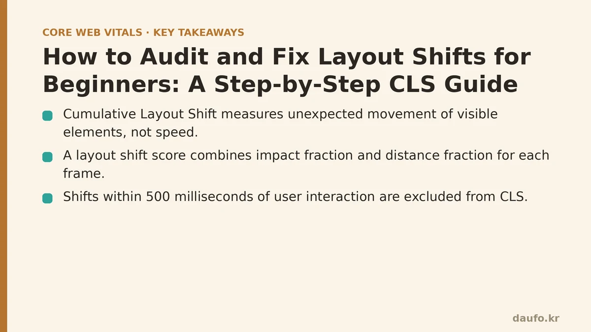
Cumulative Layout Shift tracks unexpected movement of visible elements during the loading lifecycle. It is not a speed metric. It is a stability metric. The browser calculates a layout shift score for every frame where a visible element changes position from one paint to the next, using this formula:
layout shift score = impact fraction × distance fraction
The impact fraction is the portion of the viewport affected by the moving element. The distance fraction is how far the element moved relative to the viewport’s largest dimension. A full-width banner that drops by ten percent of the viewport height produces a higher score than a small icon nudging two pixels. Shifts that happen within 500 milliseconds of a user interaction are excluded, which is why accordions and tab switches don’t count against you.
A page’s CLS is the largest burst of that score during the session window, not the sum of every shift. That detail matters later when you’re deciding whether a marginal improvement is worth the engineering time.
The scenario: a product page that keeps jumping
Picture a product detail page for a mid-sized retailer. Field data shows a CLS around 0.18 on mobile, well into Google’s “needs improvement” band (0.1 to 0.25). Desktop is fine. The layout is a grid: an image gallery on the left, a title, price, rating widget, and add-to-cart button stacked on the right, with a review section below the fold and a “recommended products” carousel that loads via JavaScript after the main content.
That’s a common shape, and it usually produces the same three culprits. The trick is confirming which one is dominant rather than guessing.
Step 1: Reproduce the shift in the lab before touching any code
Open Chrome DevTools, go to the Performance panel, and disable cache under the network throttling dropdown. Record a full page load. Chrome marks each shift with a small red rectangle in the screenshots track and annotates the layout shift events on the main thread.
The important part is clicking into the Experience row and reading the Layout Shifts entries. Each entry tells you the score and, crucially, which node moved. If you see the same element listed repeatedly, that’s your primary offender.
A more targeted alternative is the Layout Instability API, which you can hook into directly in the console or a small script:
const observer = new PerformanceObserver((list) => {
  for (const entry of list.getEntries()) {
    if (!entry.hadRecentInput) {
      console.log("Shift score:", entry.value);
      entry.sources.forEach((source) => {
        console.log("Moved node:", source.node);
        console.log("Previous rect:", source.previousRect);
        console.log("Current rect:", source.currentRect);
      });
    }
  }
});

observer.observe({ type: "layout-shift", buffered: true });
The hadRecentInput flag is what excludes shifts caused by user interaction, so filtering on it keeps your logging aligned with what Google measures. The sources array typically points at one or two DOM nodes, and reading previousRect versus currentRect shows you the direction and magnitude of the move. That’s the single most useful debugging signal in this whole process.
If the field metric is bad but the lab is clean, the shift is probably triggered by late-arriving content the lab doesn’t simulate: a personalized banner, a cookie consent bar injected after a delay, or an A/B testing script. Throttle the network harder and clear cookies to reproduce those conditions.
Step 2: Classify each shift by cause
Layout shifts almost always fall into one of four buckets. Categorizing them prevents you from applying the wrong fix.
Missing dimensions on media. An <img> without width and height attributes gets zero height until the file downloads, then expands and pushes everything below it. This is the most common cause on content-heavy pages.
Dynamically injected DOM. The recommended products carousel in our scenario doesn’t exist in the initial HTML. When it renders, it inserts a block that shifts the review section downward. The same happens with newsletter signup modals, chat widgets, and injected ad slots.
Font swaps. A custom webfont loads after first paint. When it replaces the fallback, text metrics change, and lines reflow. This causes smaller but frequent shifts.
CSS that repositions on state change. Animations using top, left, width, or height trigger layout rather than compositing, and they can register as shifts if they move visible siblings.
Step 3: Apply fixes in order of impact
Start with the images, because they’re usually the easiest and highest-scoring win. Modern browsers derive a default aspect ratio from the width and height attributes and reserve the correct space before the file loads:
<img
  src="/product-hero.jpg"
  width="1200"
  height="900"
  alt="Product shown from the front"
  loading="eager"
  fetchpriority="high"
/>
The width and height don’t need to match the rendered size in CSS, only the intrinsic aspect ratio. CSS can still set width: 100%; height: auto; and the browser will compute the reserved box. For images without known dimensions, such as user-uploaded content, wrap them in a container with a fixed aspect-ratio:
.product-thumb {
  aspect-ratio: 1 / 1;
  width: 100%;
  object-fit: cover;
}
Next, reserve space for injected content. The carousel can be wrapped in a placeholder box that holds the correct height until the script populates it:
.recommended-slot {
  min-height: 320px;
  contain-intrinsic-size: 320px;
}

@media (max-width: 600px) {
  .recommended-slot {
    min-height: 420px;
  }
}
For ad slots and third-party embeds where the height varies, min-height is a blunt instrument but it’s the only reliable one if you can’t control the injected markup. A fixed reservation is preferable to a jump, even if it occasionally leaves empty space. That trade-off is worth stating plainly because it can look wasteful to a designer.
Font-induced shifts get fixed differently. The font-display: optional value tells the browser to use the fallback if the webfont isn’t ready within a very short window, avoiding the swap entirely at the cost of occasionally not using the custom font on the first visit. font-display: swap is more common but produces a visible swap. A middle ground is size-adjust on a matching fallback font, which aligns the fallback’s metrics closely enough to the webfont that the swap causes minimal reflow:
@font-face {
  font-family: "Inter";
  src: url("/fonts/inter.woff2") format("woff2");
  font-display: swap;
}

@font-face {
  font-family: "Inter Fallback";
  src: local("Arial");
  size-adjust: 107%;
  ascent-override: 90%;
  descent-override: 22%;
  line-gap-override: 0%;
}

body {
  font-family: "Inter", "Inter Fallback", sans-serif;
}
The size-adjust and override values need to be tuned per font pair. Google publishes a calculator that generates them from a font file, which saves you the manual math.
Finally, move any transition or animation off layout-triggering properties. Replace top, left, width, and height with transform and opacity, which composite on the GPU and don’t register as layout shifts:
.drawer {
  transform: translateX(-100%);
  transition: transform 200ms ease-out;
}

.drawer.open {
  transform: translateX(0);
}
Step 4: Verify the fix and know when it’s good enough
Re-record the Performance trace with the same throttling settings and confirm the layout shift entries are gone or reduced. Then check the Lighthouse audit, but treat the lab number as a smoke test, not proof. CLS is a field metric, and the field is where the score that affects rankings lives.
For production confirmation, pull your real user data from the Chrome User Experience Report or your own RUM tool after a few days of traffic. The 75th percentile is what gets reported, so a page that’s stable for most visitors but jumps badly for users on slow connections can still fail.
Here’s the part that beginners miss: you don’t need a CLS of zero. The “good” threshold is 0.1 or below, and chasing the last hundredth of a point can cost disproportionate effort. In the product page scenario, fixing the product images and the injected carousel typically moves a page from the 0.15–0.20 range into the 0.05–0.08 range, which is comfortably good. The remaining small shifts from font swaps are usually not worth the trade-off of degrading the typography with font-display: optional.
Failure modes to watch for
A few things commonly go wrong during this process.
Reserving space with a fixed min-height on an ad slot can backfire on very narrow viewports where the ad renders taller than the reservation, producing a large shift at the moment it loads. Test each breakpoint.
Setting aspect-ratio on an element that also has height: auto and a conflicting explicit height can produce an unexpected box. Inspect the computed box in DevTools rather than assuming.
Third-party scripts injected before your own CSS can introduce shifts you never wrote, and their behavior changes without warning. The Layout Instability API output will attribute the shift to a node, so you can at least identify the source even when you can’t control it. In those cases, isolating the embed in a reserved container is often the only defense.
Where this leaves the page
Auditing CLS is fundamentally an exercise in reading attribution data carefully, then fixing causes in the order of their contribution to the score. The browser tells you exactly which node moved and by how much. Your job is to reserve the right space, inject content into pre-sized containers, and keep animations off the layout engine. Do those three things and most pages move into the good range without heroic effort.
What does your CLS look like at the 75th percentile on mobile traffic specifically? If it’s worse than desktop, your injected content is probably the bottleneck.
Related guides: Ad and Embed Layout Shift: How to Stop Your Page from Jumping Before Your Eyes, Cumulative Layout Shift: Why Your Page Jumps Around While Loading, and Diagnosing and Fixing Common Lighthouse Audit Mistakes.
🔗 Recommended Reading
- How to Enable Browser Caching on Your Website: A Beginner's Step-by-Step Tutorial
- Web Performance Monitoring Tools Compared: Lighthouse, PageSpeed Insights, and WebPageTest
- CDN vs. Origin Server: Which to Optimize First for Latency
- Common Mistakes That Break Web Font Performance and How to Fix Them
- Site Speed Optimization for Fintech Websites: Balancing Security, Compliance, and Performance