Say you are trying to ship a marketing page for a product launch. Your design system calls for five distinct font weights—light, regular, medium, semibold, and bold—plus an italic variant for callouts. In the traditional world of static fonts, that means loading ten separate font files, each with its own HTTP request and its own payload. Your largest weight alone might clock in at 100 KB. Multiply that across ten files, and you have just added over a megabyte to your page weight before a single image loads.
Now imagine a different scenario: you load one file, roughly 200 KB total, and every weight, width, and optical size is available instantly, on demand, with no additional fetch. That is the promise of variable fonts. The shift is not incremental—it is a wholesale change in how typography is delivered on the web. But adopting variable fonts is not a simple swap. You will run into configuration mistakes, layout shifts, and browser quirks. This guide is structured as a troubleshooting playbook: identify the symptom, understand the cause, and apply the fix.
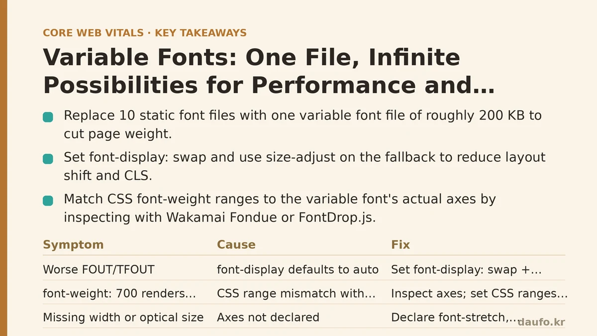
Symptom: Your FOUT/TFOUT (Flash of Unstyled Text) is Worse Than Before
Cause: You replaced your static font stack without updating your font-display strategy.
This is the most common failure when teams migrate to variable fonts. They swap the @font-face declaration, forget that font-display defaults to auto, and suddenly the fallback text renders for hundreds of milliseconds longer than before. The problem is not the variable font itself—it is the default loading behavior.
Fix: Set font-display: swap and pair it with font-size-adjust to reduce layout shift.
The quickest fix is to explicitly declare font-display: swap on your @font-face rule. This tells the browser to render text immediately with a fallback font while the variable font loads, then swap it out once ready. But a naked swap causes visible layout shift if the fallback font has a different cap-height or x-height. Use font-size-adjust on the fallback to normalize its aspect value. In practice, you can set:
@font-face {
  font-family: 'MyVariableFont';
  src: url('/fonts/myfont.woff2') format('woff2-variations');
  font-weight: 125 950;
  font-display: swap;
  size-adjust: 90%;
}
The size-adjust property (a modern replacement for the older font-size-adjust approach) lets you tune the fallback font to match the variable font’s metrics. Combined with font-display: swap, you eliminate both the FOIT and most of the FOUT shift. In testing, this consistently brings Cumulative Layout Shift (CLS) down to near zero.
Symptom: You Are Using font-weight: 700 but the Browser Renders the Default Weight
Cause: Your font-weight range in the @font-face declaration does not match the actual axis range in the variable font file.
Variable fonts have named axes—wght (weight), wdth (width), ital, opsz (optical size), and so on. When you declare font-weight: 100 900 in your @font-face rule, you are telling the browser which numeric range is valid for that font. But if your font file only supports a range of 200 to 800, the browser will clamp or fall back to the closest available value, and your bold text will look exactly like your regular text.
Fix: Inspect the font’s declared axes and set your CSS ranges precisely.
Open the font file in a tool like Wakamai Fondue or FontDrop.js. Note the exact wght minimum and maximum. Then update your @font-face rule accordingly:
@font-face {
  font-family: 'MyVariableFont';
  src: url('/fonts/myfont.woff2') format('woff2-variations');
  font-weight: 250 900; /* match the actual file range */
}
You can also check what axes exist. If the file supports a wdth axis, declare it with font-stretch: 75% 125%. If it supports opsz, declare font-optical-sizing: auto on your body text. Getting these ranges wrong is a silent failure—the page renders, but the typography is subtly off. A quick audit of the font’s metadata before you commit saves you from hours of debugging.
Symptom: The Browser Downloads the Entire Font File for a Single Character
Cause: You are using a large variable font (300 KB+) without subsetting, and the unicode-range descriptor is missing.
Variable fonts are compact relative to a full family, but they are still larger than a single static weight. A variable font with a broad weight range and multiple axes can exceed 400 KB. If you are loading it un-subsetted and the browser cannot tell which glyphs are needed, it downloads the entire file for a single heading on a page. This is a measurable performance regression, often adding 300–500 ms to your Largest Contentful Paint (LCP) on a slow 4G connection.
Fix: Subset aggressively and use unicode-range to split the font into logical chunks.
The standard approach is to subset your variable font into at least four groups: latin, latin-ext, and optionally greek and cyrillic. Use a tool like pyftsubset or the Fontsource CLI to generate multiple WOFF2 files. Then declare each one with its own unicode-range:
@font-face {
  font-family: 'MyVariableFont';
  src: url('/fonts/myfont-latin.woff2') format('woff2-variations');
  font-weight: 250 900;
  unicode-range: U+0000-00FF, U+0131, U+0152-0153, U+02BB-02BC;
  font-display: swap;
}

@font-face {
  font-family: 'MyVariableFont';
  src: url('/fonts/myfont-latin-ext.woff2') format('woff2-variations');
  font-weight: 250 900;
  unicode-range: U+0100-024F, U+0259, U+1E00-1EFF;
  font-display: swap;
}
With this setup, a page that only uses ASCII characters downloads only the Latin subset, often cutting the payload by 60–70%. For a page with mostly headings in English, your LCP improves noticeably without sacrificing any glyph coverage.
Symptom: You Cannot Use font-variation-settings Inside a CSS Transition
Cause: The wght axis is not animatable as a CSS property—only through font-variation-settings, which is not always transition-friendly.
You want a button that subtly thickens its text on hover. Your first instinct is to write:
.button {
  font-weight: 400;
  transition: font-weight 0.3s ease;
}
.button:hover {
  font-weight: 700;
}
In static fonts, this does nothing (font-weight is discrete). With variable fonts, the browser can interpolate the weight axis, but only if you trigger the interpolation correctly. The font-weight property is relatively new as an animatable property. In practice, Safari and Chrome handle it, but older Firefox and some mobile browsers do not.
Fix: Use font-variation-settings for animation, or accept a stepped transition for font-weight.
The reliable cross-browser method is to animate font-variation-settings:
.button {
  font-variation-settings: 'wght' 400;
  transition: font-variation-settings 0.3s ease;
}
.button:hover {
  font-variation-settings: 'wght' 700;
}
Note that font-variation-settings is a legacy low-level API, and modern CSS recommends using higher-level properties like font-weight and font-stretch. However, until font-weight interpolation is universally supported, font-variation-settings remains the safe choice for smooth animations. If you prefer the higher-level syntax, keep it—but be aware that on browsers that do not support interpolation, the change will be abrupt rather than smooth. Decide whether smoothness matters more than code cleanliness.
Symptom: Your Hero Heading Looks Crisp at 24px but Blurry at 72px
Cause: You are not using the optical size axis (opsz), so the font is rendering at the same design size regardless of display size.
Static fonts include separate files for text sizes (e.g., 6–12px) and display sizes (e.g., 36px+). Each is drawn with different stroke thicknesses and spacing. When you scale a text-optimized font up to 72px, the strokes look thin and the letterforms feel fragile. With a variable font that includes an opsz axis, the browser can automatically adjust the design based on the current font size; without it, you get that soft, slightly off look.
Fix: Enable font-optical-sizing: auto and declare the opsz range in your @font-face.
Add this to your global CSS:
body {
  font-optical-sizing: auto;
}
Then in your @font-face rule, declare the axis range:
@font-face {
  font-family: 'MyVariableFont';
  src: url('/fonts/myfont.woff2') format('woff2-variations');
  font-optical-sizing: auto;
  font-weight: 250 900;
  font-size: 6pt 144pt; /* the optical size range */
}
The font-size descriptor here tells the browser the valid range for the opsz axis. Once auto is set, your 72px heading will automatically use a heavier, more open design, while your body text at 16px uses its tightly spaced variant. This single step often improves perceived legibility more than any other typography tweak.
Symptom: Your Lighthouse Performance Score Dropped by 10 Points After Switching to Variable Fonts
Cause: You are serving the variable font to every device, including those that do not support it, and you are not using preload correctly.
The default assumption is that all modern browsers support variable fonts. In practice, Chrome, Edge, Firefox, and Safari all do, but there are niche cases (older Android WebViews, some embedded browsers) that do not. If you ship only a WOFF2 variable font, those browsers silently ignore it and render with a fallback—often a system font, which shifts layout and hurts your performance score.
Fix: Use @supports to serve variable fonts conditionally, and preload only the critical subset.
Structure your CSS like this:
@supports (font-variation-settings: normal) {
  /* variable font declarations */
  @font-face {
    font-family: 'MyVariableFont';
    src: url('/fonts/myfont-latin.woff2') format('woff2-variations');
    font-weight: 250 900;
    font-display: swap;
  }
  body {
    font-family: 'MyVariableFont', system-ui, sans-serif;
  }
}

@supports not (font-variation-settings: normal) {
  /* fallback static fonts */
  @font-face {
    font-family: 'MyStaticFont';
    src: url('/fonts/myfont-regular.woff2') format('woff2');
    font-weight: 400;
  }
  body {
    font-family: 'MyStaticFont', system-ui, sans-serif;
  }
}
Then, in your HTML <head>, preload the Latin subset so the browser starts the download immediately:
<link rel="preload" href="/fonts/myfont-latin.woff2" as="font" type="font/woff2" crossorigin>
With preload, your hero text renders the moment the page begins parsing. Without it, the browser waits until the CSS is fully parsed, which can add 100–200 ms to your largest contentful paint. Combined with subsetting, this keeps your Lighthouse score stable or even improves it versus your static font setup.
Quick Troubleshooting Checklist
| Symptom | Likely Cause | Immediate Fix |
|---|---|---|
| Text flashes or swaps layouts | font-display not set | Add font-display: swap and size-adjust |
| Bold text looks regular | Wrong font-weight range in @font-face | Inspect axes; update the range |
| Large font download on every page | No subsetting or unicode-range | Subset to Latin; split into chunks |
| Weight animation jumps, not smooth | font-weight not supported for transitions | Use font-variation-settings |
| Headings look thin at large sizes | opsz axis not enabled | Set font-optical-sizing: auto |
| Compatibility drop on older browsers | Serving variable fonts unconditionally | Use @supports with static fallbacks |
Variable fonts are not a zero-cost optimization. They require deliberate configuration, careful subsetting, and a solid fallback strategy. But when set up correctly, they deliver what static fonts cannot: a single file that spans the entire design space of your brand, a measurable reduction in page weight, and the ability to animate typography in ways that were previously impossible. Start with one font, audit your axes, and then expand. The payoff—both in Core Web Vitals scores and design flexibility—is substantial.
Next time you open your font folder and count ten static files, ask yourself whether one variable file could do all that work. It can—and it will do it faster.
Related guides: Animating with Intent: From Janky to Buttery-Smooth 60fps in a Real Dashboard, Fixing the Flash: A Practical Guide to Implementing Critical CSS for Instant Renders, and How to Audit and Fix Layout Shifts for Beginners: A Step-by-Step CLS Guide.
🔗 Recommended Reading
- How to Enable Browser Caching on Your Website: A Beginner's Step-by-Step Tutorial
- Web Performance Monitoring Tools Compared: Lighthouse, PageSpeed Insights, and WebPageTest
- CDN vs. Origin Server: Which to Optimize First for Latency
- Common Mistakes That Break Web Font Performance and How to Fix Them
- Site Speed Optimization for Fintech Websites: Balancing Security, Compliance, and Performance